
Material Design (originally referred to as and codenamed “Quantum Paper”) was developed by Google and is a design language used for Android devices. The idea, according to Matias Duarte Vice President of Design for Google, is to provide a design language which mimics the feel of pen and paper. Material design offers the user physical edges and surfaces to work with – with seams and shadows giving context to what parts of a digital design can be touched.
Daniel Sacks, the Senior Writer for Fast Company Magazine, says; “Design is about 3 dimensions and the 5 senses.” Material design ensures 3 dimensionality in digital design.
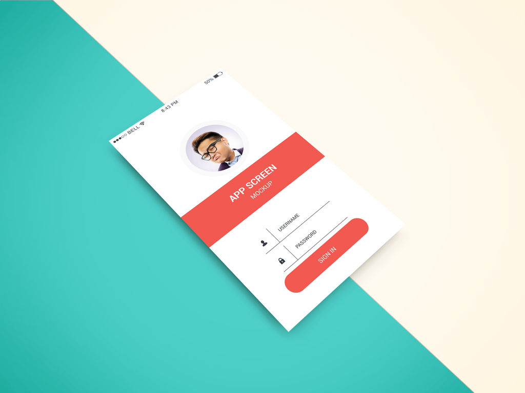
Author/Copyright holder: graphberry. Copyright terms and licence: CC BY-SA 3.0.
Material design adds additional depth to design without changing the basic functionality of designs.
About Material Design
Material Design was announced by Google at the 2014 Google I/O Conference on June 25th, 2014. It is intended for use with all versions of Android after 2.1 and in conjunction with the v7 appcomcat library and later versions. Google itself is in the process of ensuring all of its own products provide a consistent experience with Material Design as the fundamental basis of this experience.
Third party developers can incorporate Google’s Material Design functionality in their own work using freely available Application Programming Interfaces (APIs). For browsers that cannot support Material Design in its native format there is also a collection of user interfaces under the label “Polymer” that mimics Material Design for those browsers.
There are various components of Material Design for integration with Android Apps including:
The material theme – this offers a new style of display for Android apps. It has in built systems widgets that allow the developer to quickly and easily transform the colour palette. There are also a bunch of default animations for touch feedback and other activity style transitions.
List and card support – there are two widgets which support Material Design’s list and card formats which include all styles and animations. The list widget is RecyclerView and the card widget is CardView.
Material Design also added a change to the way shadows are displayed and they now have (in addition to the old x and y components) a z component which shows the elevation of view and affects:
High z values lead to big shadows and low z values to small ones
High z values also determine that the component will appear above other views in the mix
Animations are supported via APIs that allow the developer to build bespoke animations for touch feedback in the UI as well as changes in view states and activity transitions. These:
Allow the application to respond to touch events by displaying touch feedback animations
Enable you to hide and reveal views using circular reveal animations
Allow the use of curved motion to make animations appear more natural to the user
Allow you to develop custom activity transition animations
Allow you to animate changes in one or more views using “view state change”
Show a full list of animations in state list drawables between view state changes
Touch feedback animations are also offered in several standard views (for example for buttons) these can be easily customized and then placed into your own custom views
Drawables are also changed and there are three main changes offered to developers:
Vector drawables can now be scaled without any loss of definition and are recommended for single-color in-app icons
Drawable tints can be used to define bitmap images as alpha masks and then be tinted during runtime with other colors
Color extracts allow you to quickly and automatically extract any prominent colors from an existing bitmap image
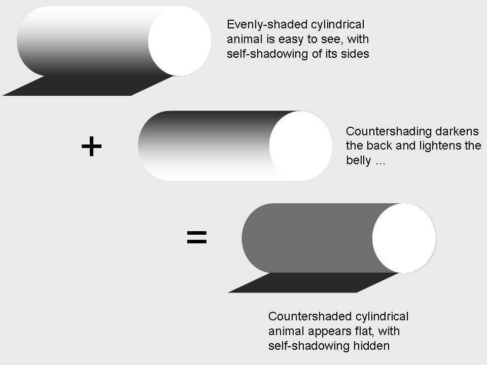
Author/Copyright holder: Chiswick Chap. Copyright terms and licence: CC BY-SA 3.0
Shadows change the way that we perceive objects on screen and in real life too.
Of course while these are the main changes made for Material Design compared to previous Android development there is a full list of changes and principles offered at Google’s website that provides a full guide to the new developer or returning developer as to the ins and outs of Material Design best practices.
There is also a JavaScript implementation of Material Design which is called Angular Material and based on Google’s best practices and Material Design specification.
The Take Away:
Material Design is a key approach to the Android Platform for both UI and UX. Designed and developed by Google it is intended to facilitate a consistent user experience on the platform so that apps do not promote user confusion. The design principles involved are intended to reflect the need for a high quality touch experience and offer a “pen and paper” style feel to the UI. Google’s own offerings will reflect Material Design throughout their range and the majority of their products (such as Gmail, YouTube, etc.) already do so.
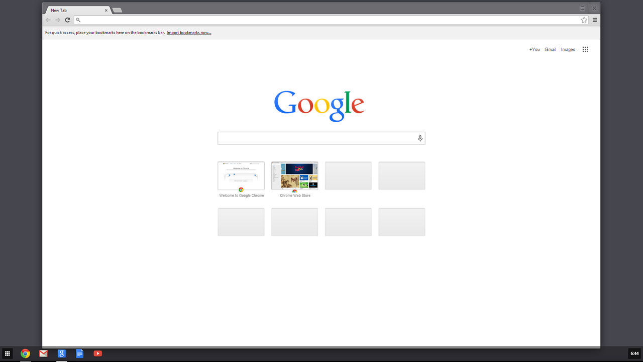
Author/Copyright holder: Unknown. Copyright terms and licence: Unknown.
Google Chrome also benefits from material design. All Google products are now developed with Material Design in Mind.
Designers working in a mobile design capacity are going to have to become familiar with Material Design as are developers.
References
Google’s complete material design guidelines can be found here.
The JavaScript implementation of material can be found here.
Hero Image: Author/Copyright holder: Ancella Simoes. Copyright terms and licence: CC BY 2.0


