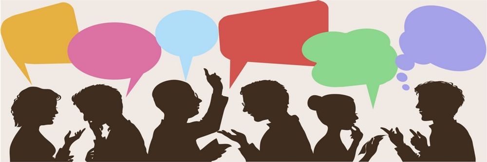
Fear plays such a dominant role in our lives that several businesses and products have succeeded on the back of this single emotion. Here’s a look at some of the fears that affect our decision making, how businesses and products exploit these tendencies to their advantage, and how, as a designer, you can apply this knowledge in your work to design better (and possibly more ethical) products.
Picture this: You're walking along a dirt path on the outskirts of a dense forest. You hear the gentle rustling of leaves. From the corner of your eyes, you notice something move… something large and orange. Quick! How will you react?
You probably won’t face a wild tiger without the safety of a safari van to keep you from getting mauled. For our ancestors, though, this would have been a real threat.
Fear is our instinctive response to perceived danger. When faced with life-threatening situations, we must make snap judgments to save our lives—prepare to fight, or flee.
Our modern world does not pose the same risks to our lives that our ancestors faced. But we continue to experience fear, in varying degrees, in different, non-life-threatening circumstances. Many of these modern fears are conditioned. That is, we associate certain situations with negative or unpleasant experiences. Fear is our brain’s alarm signal, warning us that something bad is about to happen.
Our fears—both instinctive and conditioned—have inspired more than just a few businesses over the years. Here's a look at some of the fears that we experience, how businesses take advantage of them, and how we can apply an understanding of fear in design.
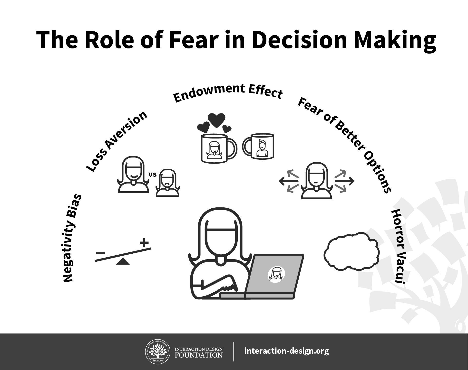
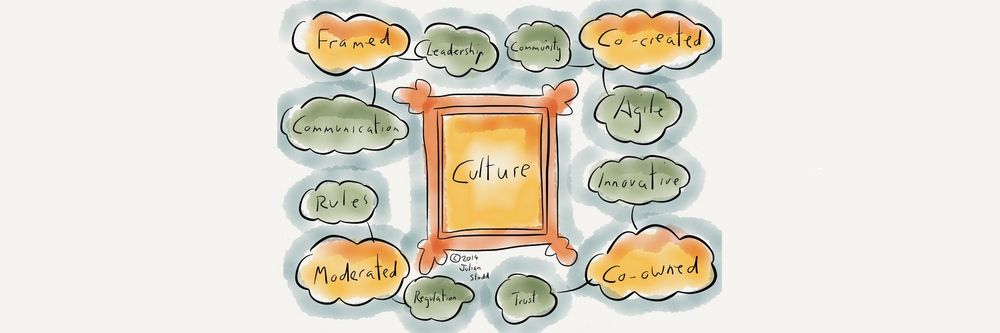
Author/Copyright holder: Christian Briggs, Daniel Skrok and The Interaction Design Foundation. Copyright terms and license: CC-BY-NC-SA 3.0
Fear is the brain’s warning system about forthcoming unpleasant experiences. We are hardwired to pick up negative signals and attach more weight to them than we would for gains we might enjoy. We’re afraid of missing out while also fearing better options. We’re afraid of losing our possessions and feel intimidated by emptiness. Indeed, some people may say they’re scared of “nothing”; “nothing” in this sense, though, can be mighty terrifying.
Negativity Bias
Thanks to our ever-vigilant ancestors, we are primed to focus more on signals of danger, as compared to pleasantness. This evolutionary trait, to be constantly on the lookout for danger, has consequences on our relatively safer modern lifestyle.
Imagine that one of your colleagues harshly criticized an aspect of your work. Chances are, the criticism will have a deep impact on you—the negative sentiments from their cutting words will likely stay with you much more than the positive aspects of your day, such as the wonderful weather outside or a compliment from another colleague. This negativity bias is the reason news services skew their reporting towards bad news. Even though our world is a much better place than the one our ancestors lived in, our primal brain is still keen to listen to and remember bad news.
Negativity bias associated with the human survival instinct directly impacts your work as a user experience designer: even a single usability flaw in your product will offset all the amazing features you put together in your solution.
For example, if your application requires the user to log in before they can access any feature of your product or service, and then asks them to prove they’re human, they will likely get frustrated and leave.
Author/Copyright holder: Nils Gronkjaer. Copyright terms and license: Fair Use (source)
Many websites ask users to “prove” that they’re human. While this is to prevent robots from pretending to be humans, it comes at the cost of the users’ experience. As robots become more sophisticated, so do the tests of “humanity”. These tests are often difficult for users to solve, which can frustrate users to the point that they may just leave your website or app.
Loss Aversion
If we were to toss a coin and say, “Heads you win $10, tails you lose $10,” would you play along? Nobel Laureate Daniel Kahneman and Amos Tversky conducted experiments similar to this and found that people were interested in participating in this game only if the reward was double the amount the penalty cost. Through these experiments, they defined loss aversion: the psychological pain of loss is far greater than the pleasure of gain.
Our fear of loss applies to things we have, that we’d not like to lose, such as money, vacation pictures or music concert tickets. It also applies to what we don’t have, but stand to lose—say, the live sporting event that clashes with our music concert; in other words, the fear of missing out (FOMO).
From seasonal discount sales to limited-edition merchandise, and from music concerts to sporting events, most marketing campaigns are built around loss aversion and FOMO. For example, Amazon’s “Lightning Deals” combine discounts with limited time and stocks to invoke our fear of missing out on a sweet deal.
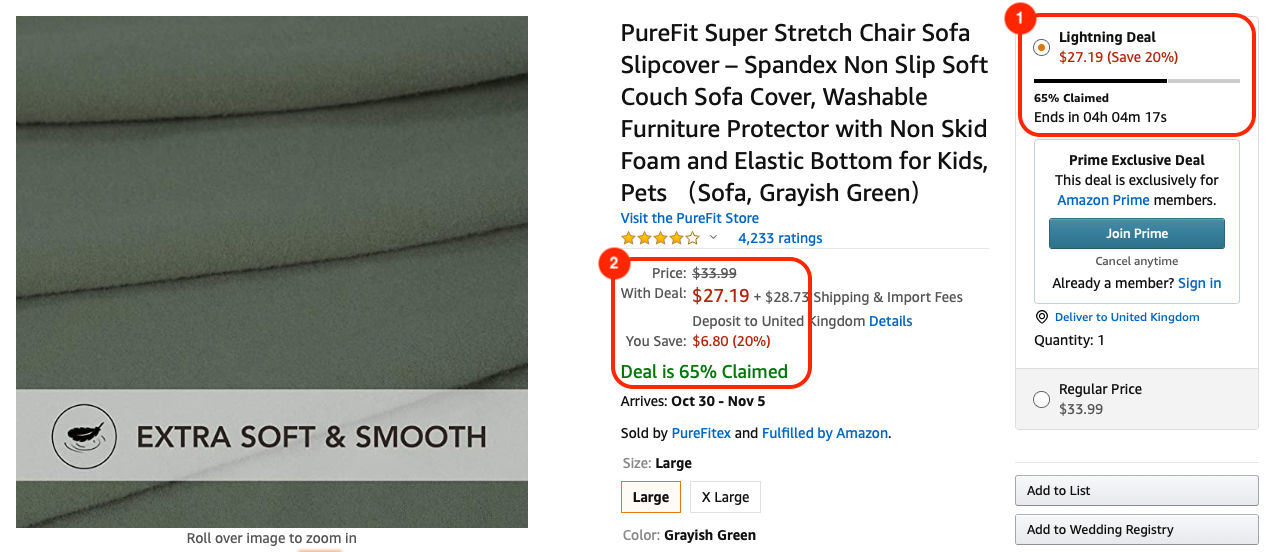
Amazon offers “Lightning Deals” to encourage users to purchase. All products in such deals show that the items are available at discounted rates for a limited time and in limited stock. 1) The countdown shows that this particular deal will be available only for about four hours. The progress bar just above the clock indicates to what extent the deal has been claimed. This tells the user that the deal could actually end before the clock hits zero. 2) The information about potential savings and that the deal is already 65% claimed is shown twice on the page, to motivate users to claim it before it has gone.
Endowment Effect
The endowment effect refers to our emotional attachment to the objects that we own. You might experience this effect when you try to clear your closet. Some objects are harder to get rid of than others. We also tend to value these objects higher than what they are worth. That is, if we were to hold a yard sale, we would demand more money for our possessions than others would be willing to pay.

Copyright holder: New Line Cinema. Copyright terms and license: Fair Use
Like the creature Gollum in The Lord of the Rings Trilogy, we get attached to our possessions and do not like to part with them.
Nothing can be worse than waking up to find all our possessions have disappeared. That is exactly what happened in 2009 with customers when Amazon deleted digital copies of books from Kindle devices. In 2018, Apple users found out that some movies that they had purchased had disappeared from their iTunes library. Unlike physical books, cassettes and CDs, ownership of media on cloud-based services is not absolute. Large companies like Amazon and Apple can get away with it (to a certain extent). But for most smaller services, it is best not to antagonize users.
To capitalize on our possessive nature, many software and collaborative tools subtly hint at ownership with words like “Your Work” or “My Files”. Some subscription and Software-as-a-Service (Saas) services often include file storage and back-up as premium services to encourage users to opt for purchases.
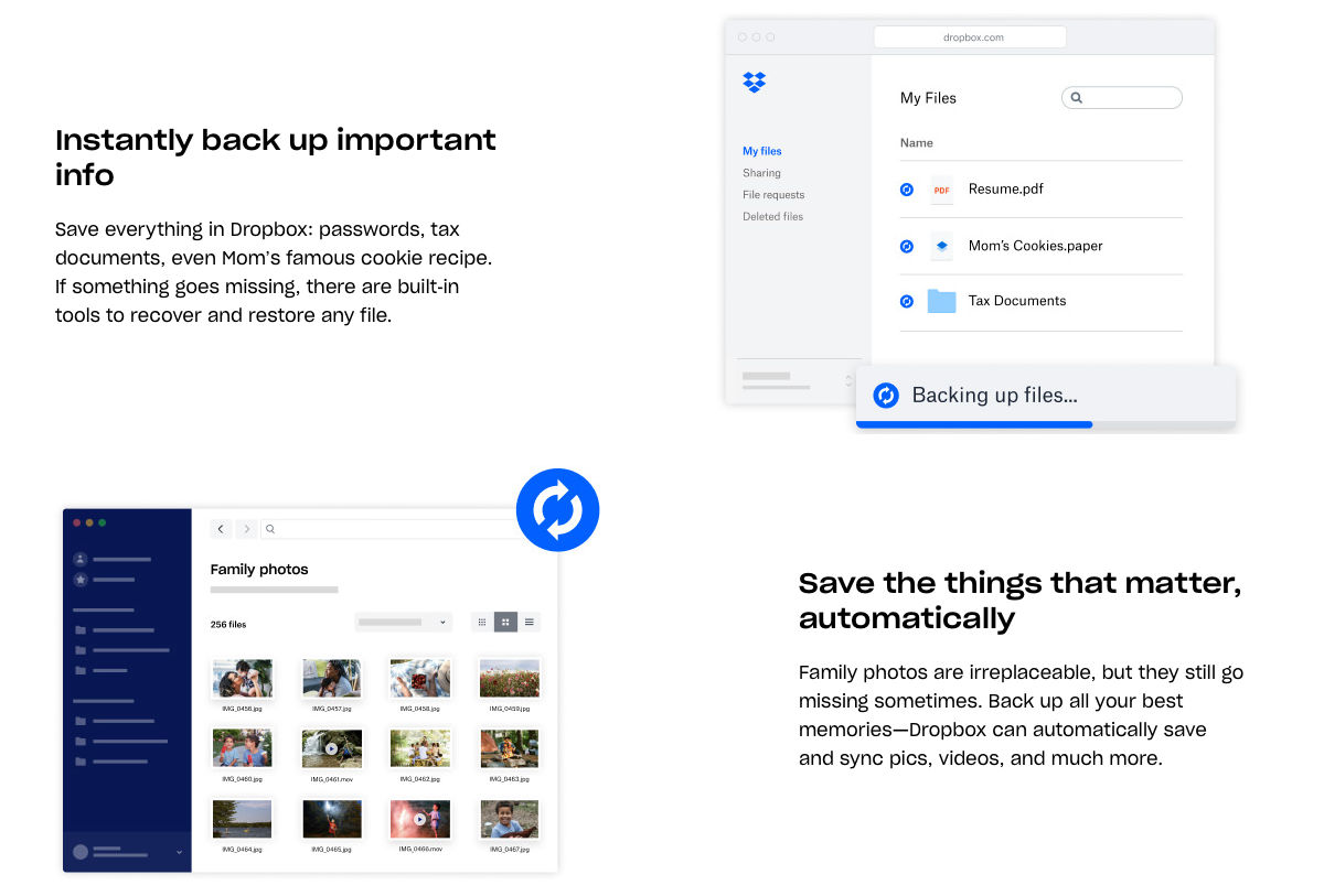
Cloud storage services such as Dropbox here take the endowment effect into consideration, with promises to safeguard our digital possessions with “built-in tools to recover and restore any file” and automatic back-ups of photographs and videos.
Fear of Better Options
If you’ve bought a mobile phone, you’ve likely come across this fear. Screen sizes, the number of cameras, their resolution, the battery capacity, price... The number of factors that influence our decision to purchase is endless, and it appears that there are infinite devices with identical specifications. Even after we make the purchase, there’s a voice at the back of our head that says, “Are you sure you made the right decision?”
The internet opens up a whole world of choices, where anyone can offer a value proposition to people across the planet. Choices are desirable. Four options are better than two. (And one option isn’t an option, incidentally; it’s called “being backed into a corner”.) But weighing a thousand options can overwhelm us to the point that causes us not to decide at all.
Here’s a look at the pricing options for two video conferencing platforms: Zoom and GoToMeeting. Zoom shows four plans. On closer examination, however, we find more than 15 options spread across different categories and separate add-ons for each. By contrast, its competitor GoToMeeting has a much simpler pricing structure that helps users make a quick decision.
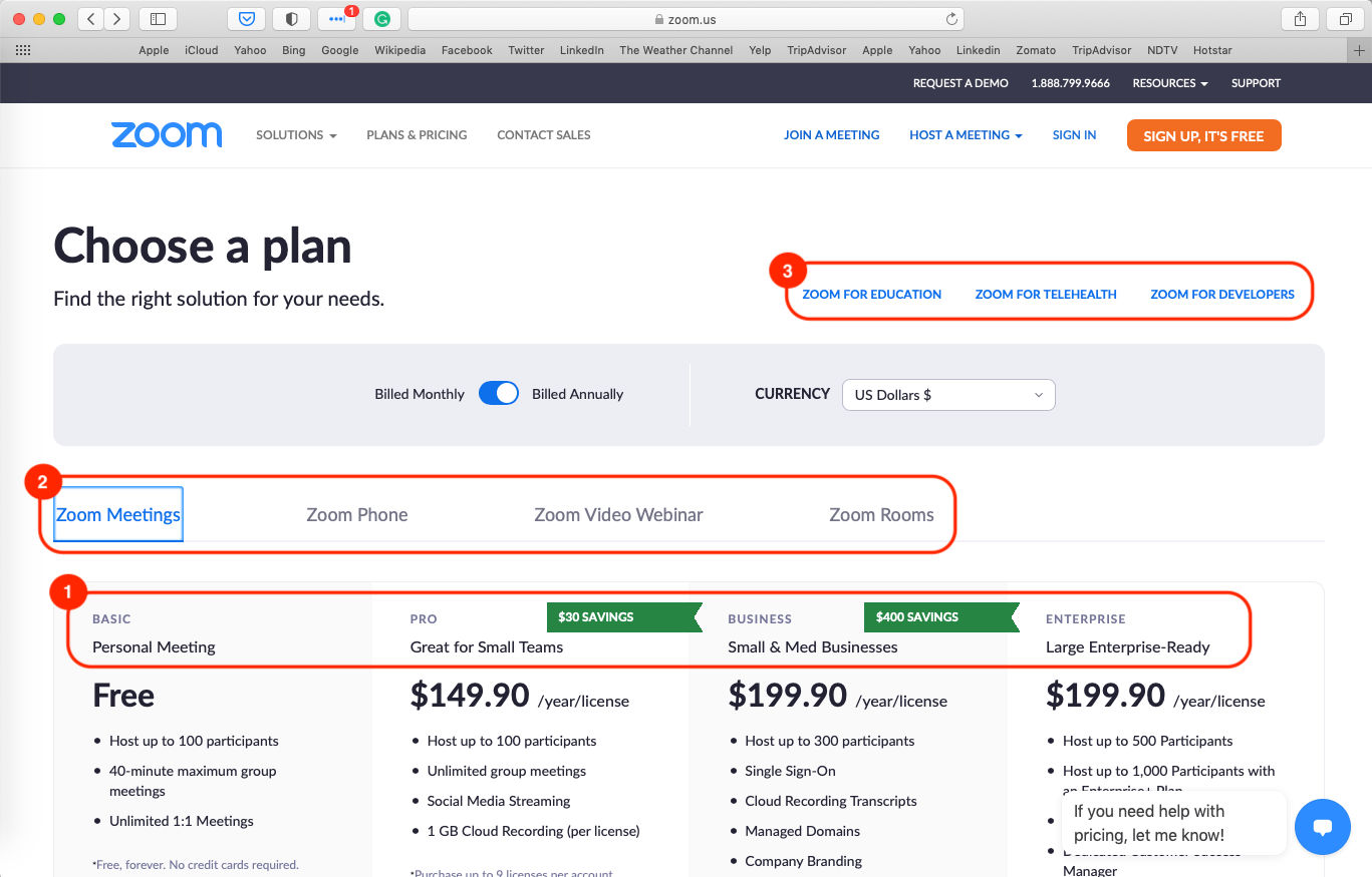
1) Zoom offers four plans: Basic, Pro, Business and Enterprise. 2) On closer examination, we see that these plans are for Zoom Meetings. There’s another set of plans for Phone, Video Webinar and Rooms. 3) We also see that there are separate pricing options for Education, Telehealth and Developers. This large set of options is bound to confuse users.
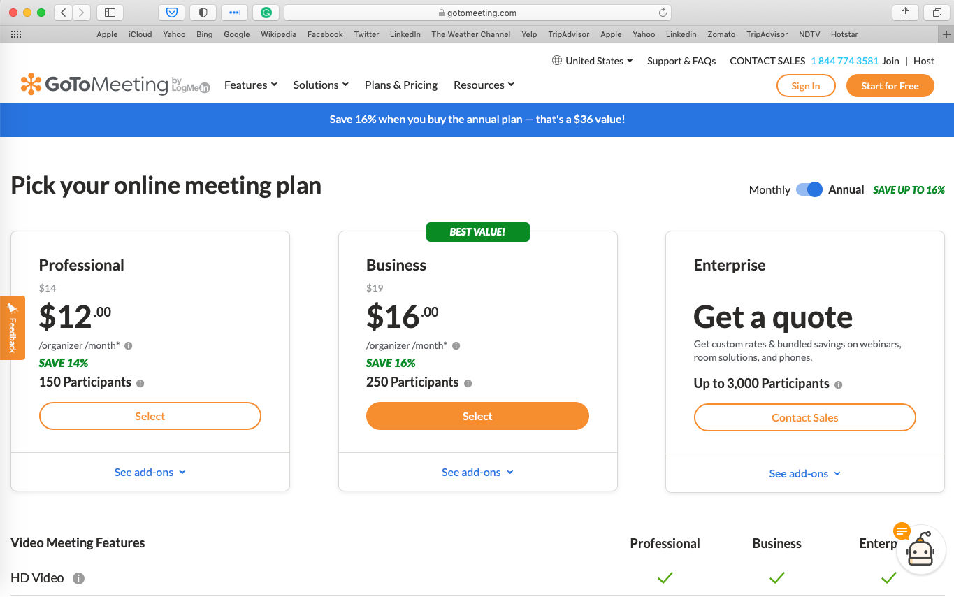
GoToMeeting’s pricing page has only three options, which makes it easy for potential users to decide which plan matches their requirements.
Horror Vacui
The concept of Horror vacui—the fear of emptiness—was coined in the Victorian era (1837–1901). At the time, white space in art and design was looked down upon, and artists feared leaving any space empty. From complex paintings and ornamental motifs to intricate sculptures and patterns on buildings, creatives in the past seemed to have a compulsion for filling up every inch of their work surface, as if it might imply laziness to leave anything untouched. Modern design, however, values minimalism. In user experience design, less is often more. A busy interface with multiple choices will confuse users.
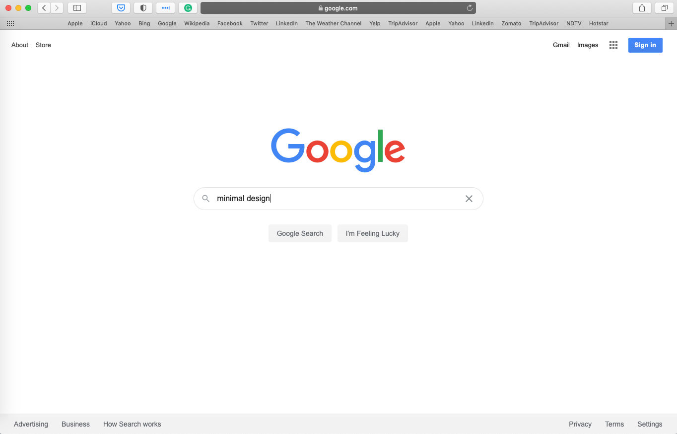
The Google search engine has only one form field, front and center. While there are other links on the screen and a button to sign in, the generous use of white space calls the user’s attention to the primary search functionality.
The fear of emptiness takes on another meaning for interfaces—empty states. If your products require users to create and manipulate content, for example, text- and image-editing applications, then the initial screens will likely have no data available.
Empty states can be intimidating, especially for a user trying out your solution for the first time. Where does the user begin? How does the application fit into the user’s current workflow? This is where carefully crafted messages can help guide first-time users around the application and offer prompts to help them get started with the product.
The Yahoo Mail application takes empty states up one level with messages that users can relate to. The application recognizes that users like to see a clean inbox, with all emails dealt with and archived. Instead of showing a generic message like “There are no emails.”, the application celebrates an empty inbox as an achievement.
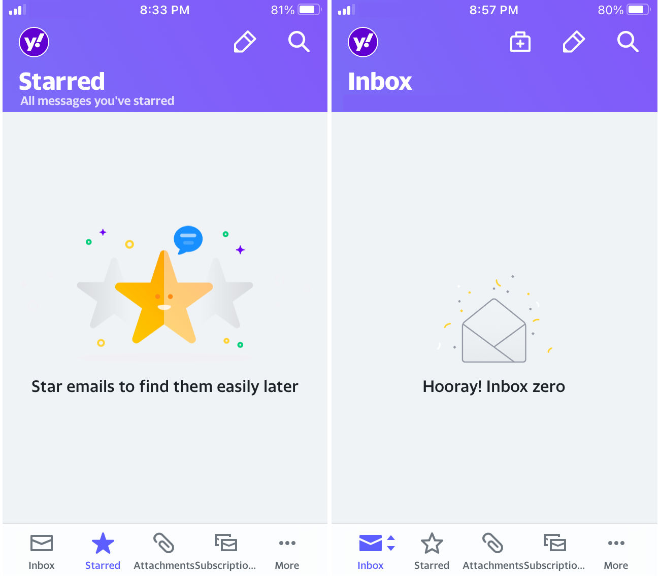
The Yahoo Mail app uses playful graphics to inform new users about functionality (left) and celebrates an empty inbox when the user has managed to clean up all emails (right).
What Do Our Users Fear?
Fear is a huge factor in our decision making. The fears we’ve listed here are only a few broad ones. There are other strong emotions that prompt users to make decisions. For instance, dating apps capitalize on loneliness, while ride-sharing apps prey on our desire to be independent and mobile.
Keep these emotions in mind when you conduct interviews or draft questions for use in surveys. Try to understand if certain fears dominate your users’ behavior in the context of your solution. If they exist, use techniques such as the 5 whys to probe further and identify the extent of the fears.
If your value proposition does not address a fear, that is also perfectly all right. You can use your knowledge of fears in the design of the features, interfaces, microcopy, marketing campaigns and pricing policies. For example, stickK is a commitment platform that uses loss aversion to help users stick to their commitments. Users sign monetary contracts and put their money on the line to motivate them to work towards their goals.
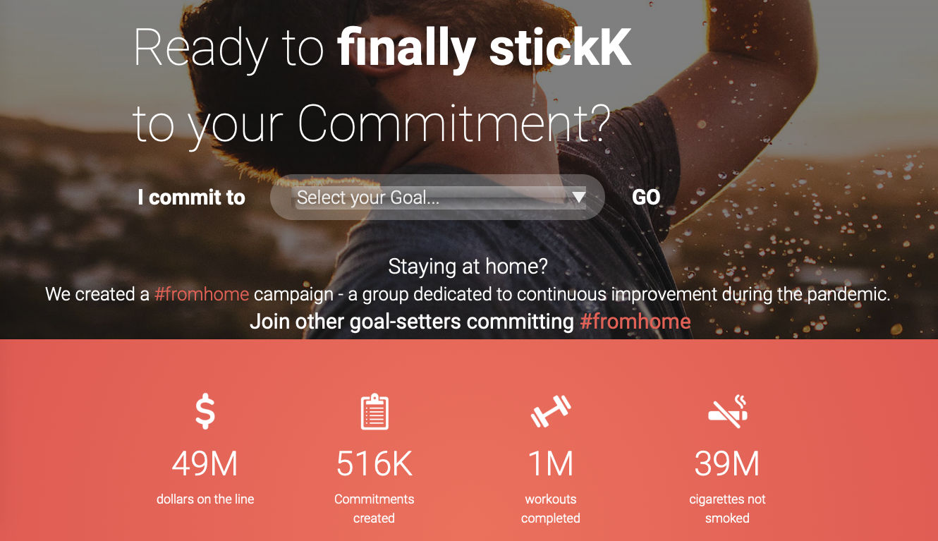
With money on the line, US-based commitment platform stickK uses loss aversion to motivate users to work towards goals such as weight loss, quitting smoking or other goals that can be difficult for people to commit to.
How Ethical is it to Take Advantage of Fears?
Business, design and ethics do not always go hand in hand. Over the years, design patterns that exploit our instinctive behavior have come to be called dark patterns.
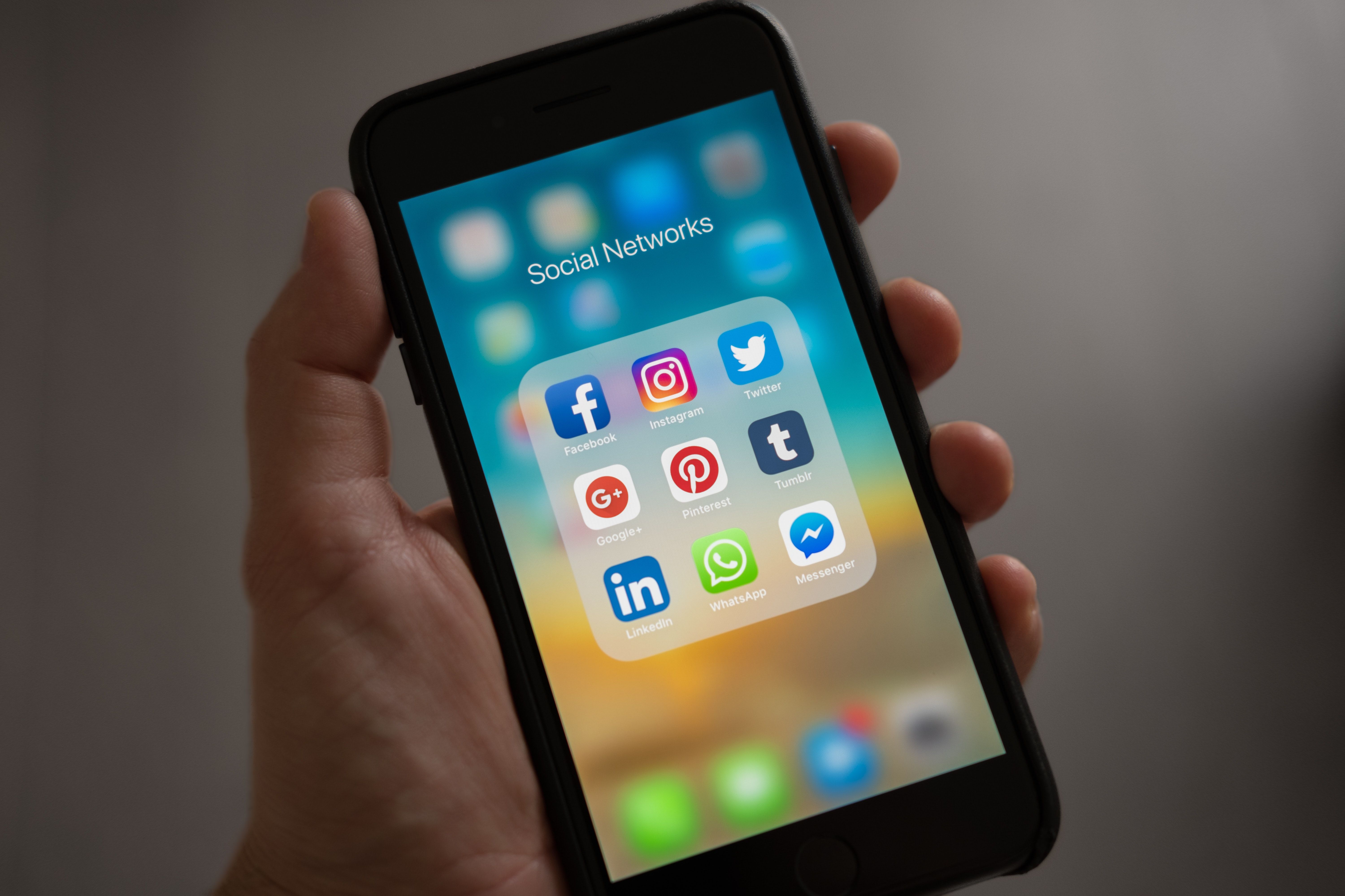
Based on user engagement and product usage, social media networks can be considered examples of great business and design. The platforms leverage loss aversion to keep users coming back. Every notification on any of the applications makes us wonder, “What’s new? What am I missing out on?”
This popularity of social media has, however, led to increased incidences of social anxiety, with users constantly under pressure to present the best and the happiest versions of their lives. Combined with our negativity bias, the platforms often resemble an endless stream of bad news with pictures of other people’s perfect lives thrown in between.
We live in a hyper-connected world. And it’s easier than ever to spread information as well as misinformation.
The ethical aspect of the use or abuse of the knowledge of human behavior can lead us down a bottomless pit. As designers, it is our duty to learn and be aware of the power of design and wield it wisely.
It is easy to get blindsided and limit our vision to our products and users. However, we live in a hyper-connected world and we cannot look at our designs in isolation. In your work, consider the big picture. How does your product fit into the user’s life? What could be the potential impact on society and the environment?
Abuse of human psychology has its limits. Massive public outcry over privacy issues as well as concerns about smartphone addiction has prompted governments as well as the companies to place safeguards. In 2018, the European Commission implemented the General Data Protection Regulation (GDPR) that mandated that digital applications be transparent about what data they collect, how they use that data and seek permission from users before they collect it. Apple provides iPhone users with a weekly summary of the number of hours they spent on their phones and provides options to set scheduled work hours and sleep times to help users reduce distractions and relax easily. While Instagram shows the “You’re All Caught Up” message, YouTube offers users the option to turn on the “Remind me to take a break” feature to limit the time spent on the application.
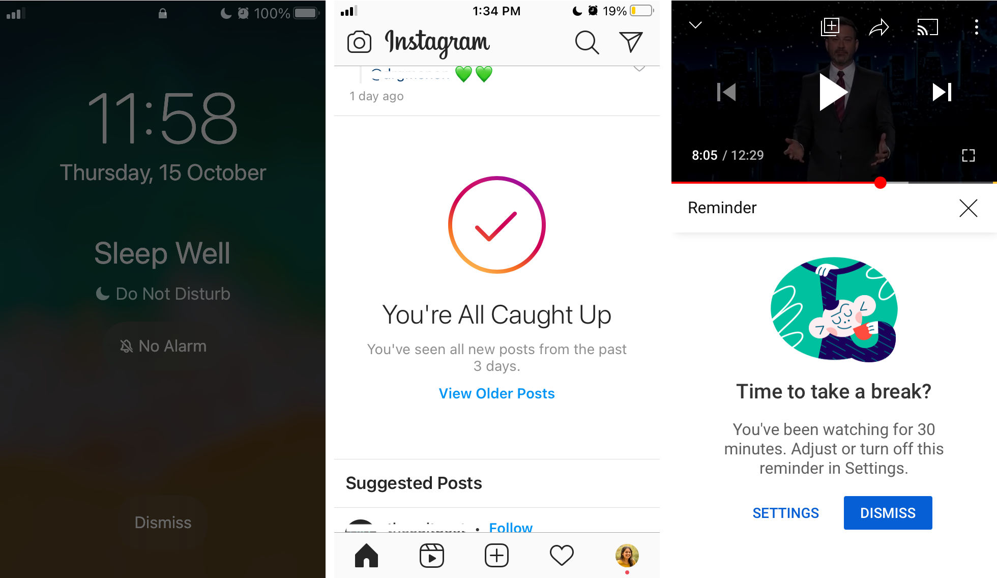
The adage “You cannot fool all the people all the time” rings true for businesses that exploit human psychology for their gains. Due to public concern over smartphone addiction, companies such as Apple, Facebook and Google have introduced features in their products to limit users’ screen time. Left: Apple’s iPhone simplifies the lock screen to remove notifications. Center: Facebook’s Instagram notifies users that they have seen posts from the past three days, and subtly reassures users that they aren’t missing out on anything. Right: Google’s YouTube pauses videos mid-way to remind users that they’ve reached their daily quota of app use.
Fear need not always be used to exploit users. As we’ve seen with stickK, products can leverage behavioral patterns for effecting positive change.
The Take Away
Fear plays a large part in our decisions. You can use the knowledge of users' fears to create designs that motivate users to adopt or purchase your product.
Our instinctive negativity bias makes it important that we find and eliminate usability flaws in our designs. Users are more likely to remember a tiny usability flaw than even the fabulous features you’ve worked hard to design. While loss aversion motivates users to make decisions so that they don’t “miss out”, the fear of better options paralyzes their decision-making capabilities in the face of several good options. The endowment effect makes us value our possessions more than they are objectively worth, paving the way for designers to get users emotionally attached to products. Horror vacui relates to our fear of emptiness. While minimalism is good in interface design, poor (or undesigned!) empty states can intimidate new users.
Used appropriately, fear is your friend that helps you create engaging products. But reckless abuse of human behavioral tendencies can also be catastrophic. Design and designers wield immense power through their work and must tread responsibly. When used ethically, targeting our fears can even help make the world a better place.
References and Where to Learn More
Here's an in-depth look at the impact of negativity bias on user experience design from the Nielsen Norman Group
https://www.nngroup.com/articles/negativity-bias-ux/
Visit topics such as loss aversion and the endowment effect through this mini-encyclopedia on Behavioral Economics
https://www.behavioraleconomics.com/resources/mini-encyclopedia-of-be/loss-aversion/
Know more about the murky world of media ownership on digital platforms in this story on The Startup
https://medium.com/swlh/the-end-of-ownership-6d80e9f75511
For more on FOMO and FOBO, read this fascinating interview on Inverse
https://www.inverse.com/innovation/how-to-overcome-fomo-fobo-decision-making
Dive deep into the fear of emptiness right here on the Interaction Design Foundation
https://www.interaction-design.org/literature/article/horror-vacui-the-fear-of-emptiness
Images
The Role of Fear in design
Author/Copyright holder: Christian Briggs, Daniel Skrok and The Interaction Design Foundation
Copyright terms and license: CC-BY-NC-SA 3.0
Screenshot of a test to prove that the user is human
Author/Copyright holder: Nils Gronkjaer
Copyright terms and license: Fair Use
Screenshot of Dropbox website
Screenshot of the pricing page of Zoom
Screenshot of the pricing page of GoToMeeting
Screenshot of the Google search engine
Screenshots from Yahoo Mail mobile app
Screenshot of skickK website
Social Network applications on a mobile phone
Author/Copyright holder: Tracy Le Blanc
Copyright terms and license: CC-0
Screenshots from iPhone, Instagram and YouTube