This chapter aims to help user interface designers and developers understand the issues involved in multi-device interactive applications, which can be accessed through mobile and stationary devices, even exploiting different interaction modalities (graphical, vocal, etc.). The chapter provides a discussion of the possible solutions in terms of concepts, techniques, languages, and tools, with particular attention to Web environments. The chapter deals with the various strategies for adapting, distributing, and migrating the user interface according to the context of use. It considers how to address such issues both when authoring multi-device interfaces and when user interfaces for different devices are dynamically adapted, distributed, or even migrated seamlessly across devices to follow the mobile user. Thus, it discusses task continuity across multiple devices in migratory interfaces as well as related usability issues.
37.1 Introduction
One of the main reasons for the increasing importance of adaptation is that we interact with our applications in contexts of use which are more and more varied because of the advent of mobile technologies and smart environments.
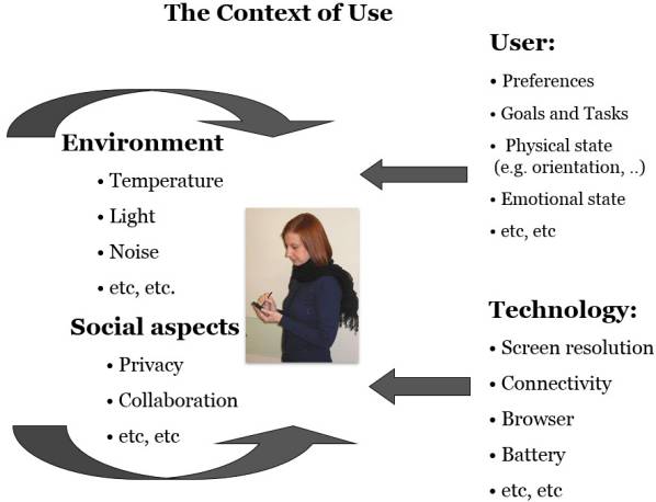
Various aspects can be part of the possible contexts of use and can be grouped along four dimensions (see Figure 1):
user-related aspects: preferences, goals and tasks, physical state (e.g. position), emotional state, etc.;
technology-related aspects: screen resolution, connectivity, browser, battery, etc.;
environment-related aspects: location, light, noise, etc.;
social aspects: privacy rules, collaboration, etc.
According to changes in those aspects of the context of use any aspect characterising a user interface can be modified. Thus, the user interface can be adapted in its: presentation—the perceivable aspects, including media and interaction techniques, layout, graphical attributes; dynamic behaviour, including navigation structure, dynamic activation, and deactivation of interaction techniques; and content, including texts, labels, and images.
Various adaptation strategies are possible, which can be classified according to the impact they have on the user interface: conservation, e.g. simple scaling of UI elements; rearrangement, e.g. changing the layout; simplification / magnification, same UI elements but with modified presentation; increase (also called progressive enhancement) / reduction (also called graceful degradation), in terms of UI elements.
Author/Copyright holder: Courtesy of Fabio Paterno. Copyright terms and licence: CC-Att-ND-3 (Creative Commons Attribution-NoDerivs 3.0 Unported).
Figure 37.1: The Context of Use
One of the main reasons for the increasing interest in user interface adaptation is the device fragmentation stimulated by technological evolution, in particular in mobile devices. Device fragmentation concerns hardware and support for formats, browsers, audio/video playback/streaming, etc. For example, in terms of screens we can notice that the screen resolutions of personal computers (PCs) usually vary between 800x600 and 1920x1200 pixels, whereas those of mobile devices have a variation of between 320x240 and 1136x640 pixels (iPhone 5) and up to 1920×1080 (Galaxy S 4). Thus, screen resolution varies more with mobile devices than with desktop ones. The interesting point is that Moore’s Law continually changes these numbers, and we can expect even more variance in the near future.
In recent years mobile technology has evolved considerably. We can easily realise this if we look at how interaction has changed in our smartphones. The oldest devices have focus-based interactions, in which the browser focus cycles through elements; the current focus of the page is easily determined because the focus element is highlighted, and the focus moves from one selectable element to another (e.g. from link to link) only sequentially, even when widely spaced (this can take some time). Then, devices supporting pointer-based interaction have been proposed, in which key-based navigation controls a pointer that can cover any part of the screen. With this solution selectable elements need to be large enough to be easily selected, since the pointer often moves in steps of 5—10 pixels, and selectable elements should have rollovers to make it clear when the pointer has entered their active area. Following the pointer-based interaction we now have the success of touch-based interaction, where events are related directly to a finger or stylus touch position on the screen; selectable elements should be widely spaced in order to allow users to select them precisely (studies suggest between 7mm and 9.6mm), selectable elements must be large enough to be easily selected; no elements are in focus until they are selected so extra information cannot be passed to the user (e.g. rollovers ineffective).
Various design aspects can be useful in supporting usability in mobile interaction. We have to consider that the user can be on the move and able to pay limited attention to the interaction. Thus, it is important to minimize text input, keep consistency between platforms so that application knowledge acquired through desktop interaction can be reused in mobile access and hence prevent user error, avoid overloading the user interface with too many elements, limit the need for zooming, and prevent touch selections that miss intended targets. Generally, we have to consider that mobile users often have short access time available, and thus they prefer access to small pieces of information.
More generally, we have to consider that our life is becoming a multi-device user experience. Indeed, a recent study (Google, 2012) found that our time online is spread across four device types (smartphones, tablets, PC/laptops, TVs). There are two modes of using them: sequential usage, moving from one device to another at different times to accomplish a task; and simultaneous usage, using more than one device at the same time for either a related or an unrelated activity. Managing information across such devices is one challenging aspect of using multiple devices. In general the main issues in multi-device UIs are: poor adaptation to the context of use, lack of coordination among tasks performed through different devices, inadequate support for seamless cross-device task performance.
Some studies have started to investigate what characterises the user experience in cross-device application access. For example, in Waljas et al. (2010) the authors have identified three important dimensions for improving cross-device user experience: appropriateness for task performance, so that the structure of the interactive application provides an effective fit with what the users expect to perform in each device type; continuity, so that the flow of interaction with and across devices is perceived as fluent and connected; consistency, the user interfaces for the various device types should be perceived as coherent, still parts of the same application.
37.2 User Interface/Task/Platform Relations
In this section we discuss a logical framework that allows designers to think about the various possible relations between the tasks to perform, the user interfaces, and the platforms available. By platform we mean groups of devices that share similar interaction resources, e.g. the desktop, the smartphone, the tablet. In particular, we have identified five possible relations:
Same task with the same user interface on different platforms
Same task with different user interface on different platforms
Same main task with different levels of subtasks on different platforms
Dependencies among different tasks performed on different platforms
Tasks meaningful only on some platform types (e.g. because they require very lengthy access or are related to a mobile position or to specific equipment such as a camera).
Because of the rapidly expanding variety of mobile technology there are indeed significant differences between different platforms. The consequence is that sometimes for the same task different user interfaces are more appropriate depending on the platform, and some specific tasks are only really appropriate for a specific platforms. For example, watching a football match does not make sense through a smartphone, even if this is technically possible, since the small screen is inappropriate for a ninety minute period and many details of the match could not be appreciated. On the other hand, this is a pleasant activity to carry out while comfortably sitting on a sofa with a large screen in front of you at an appropriate distance.
Figure 2 shows an example of the same task with different user interfaces on different platforms. The task is showing spatial information. On the left there is the version for a desktop device, which covers a wider spatial area and also provides an overview highlighting where the detail view is located. On the right, the version for the mobile device highlights the current position of the mobile user, showing a smaller area with touch control for changing the zoom level.
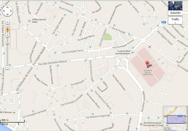
Author/Copyright holder: Google Maps. Copyright terms and licence: All Rights Reserved. Used without permission under the Fair Use Doctrine (as permission could not be obtained). See the "Exceptions" section (and subsection "allRightsReserved-UsedWithoutPermission") on the page copyright notice.
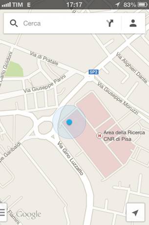
Author/Copyright holder: Google Maps. Copyright terms and licence: All Rights Reserved. Used without permission under the Fair Use Doctrine (as permission could not be obtained). See the "Exceptions" section (and subsection "allRightsReserved-UsedWithoutPermission") on the page copyright notice.
Figure 37.2 A-B: Example of same task with different user interfaces
Figure 3 shows a second example of the same main task with different user interfaces, , and some different subtasks. In this case the main task is to show the information regarding the flights of an airline. We can notice that both UIs support the possibility of searching flights and making reservations, but through different presentations and layouts; in the mobile version the interactive elements are larger to facilitate touch interaction; in the desktop version there is also the possibility of accessing additional information, e.g. regarding promotions.
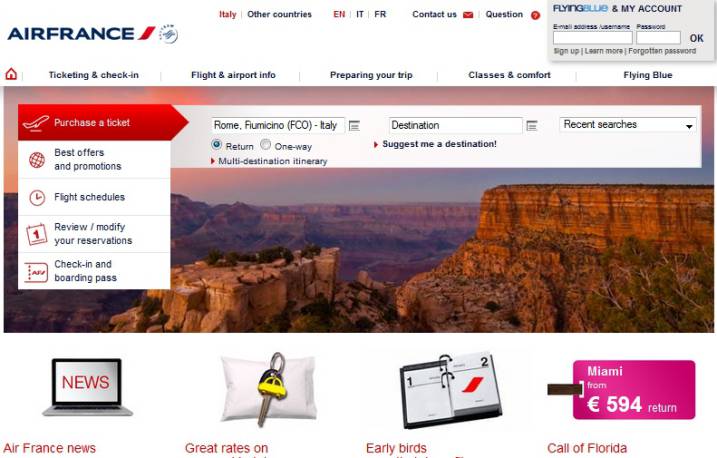
Author/Copyright holder: Air France. Copyright terms and licence: All Rights Reserved. Used without permission under the Fair Use Doctrine (as permission could not be obtained). See the "Exceptions" section (and subsection "allRightsReserved-UsedWithoutPermission") on the page copyright notice.

Author/Copyright holder: Air France. Copyright terms and licence: All Rights Reserved. Used without permission under the Fair Use Doctrine (as permission could not be obtained). See the "Exceptions" section (and subsection "allRightsReserved-UsedWithoutPermission") on the page copyright notice.
Figure 37.3 A-B: Example of same task with different user interfaces
The next figure shows two examples of applications in which the mobile version supports some tasks that are meaningful only for that platform. At the top, an example search with the keyword ‘restaurant’: the mobile version shows a set of nearby restaurants on a map and in a list, in which each element has a button to initiate an immediate phone call to the corresponding restaurant. At the bottom on the right side we can see how the mobile version of Flickr makes it possible to show pictures that were taken near the current mobile position.
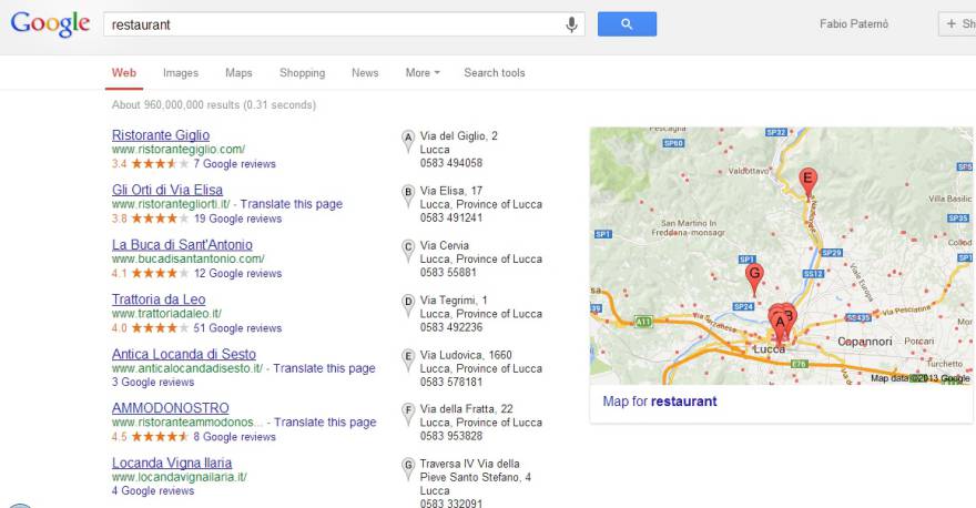
Author/Copyright holder: Google Maps. Copyright terms and licence: All Rights Reserved. Used without permission under the Fair Use Doctrine (as permission could not be obtained). See the "Exceptions" section (and subsection "allRightsReserved-UsedWithoutPermission") on the page copyright notice.
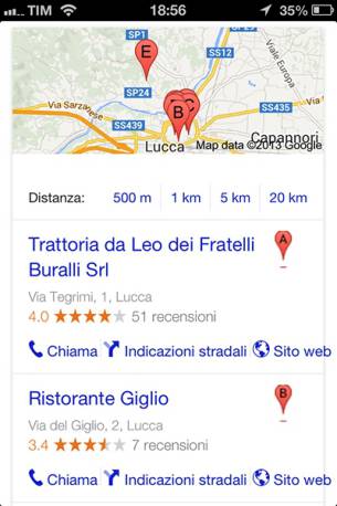
Author/Copyright holder: Google Maps. Copyright terms and licence: All Rights Reserved. Used without permission under the Fair Use Doctrine (as permission could not be obtained). See the "Exceptions" section (and subsection "allRightsReserved-UsedWithoutPermission") on the page copyright notice.

Author/Copyright holder: Flickr. Copyright terms and licence: All Rights Reserved. Used without permission under the Fair Use Doctrine (as permission could not be obtained). See the "Exceptions" section (and subsection "allRightsReserved-UsedWithoutPermission") on the page copyright notice.
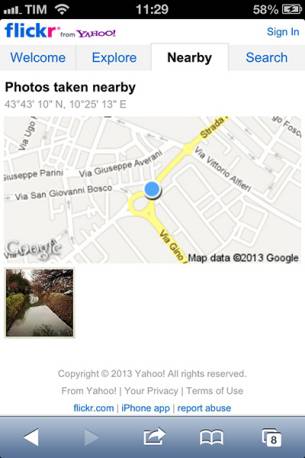
Author/Copyright holder: Flickr. Copyright terms and licence: All Rights Reserved. Used without permission under the Fair Use Doctrine (as permission could not be obtained). See the "Exceptions" section (and subsection "allRightsReserved-UsedWithoutPermission") on the page copyright notice.
Figure 37.4 A-B-C-D: Example of tasks meaningful only on some platform
37.3 Authoring Multi-Device Interactive Applications
Authoring multi-device interactive applications requires changing the traditional ways to develop interactive applications. There are various ways to address this. The simplest way is to develop separately specific versions for each target platform. In this way the developers have full control over the specific aspects of each version. However, this means multiplying the effort of developing an interactive application by the number of target platforms. Thus, it implies more effort in development and maintenance. Indeed, if something has to be changed in the application then each version needs to be updated.
Another approach consists of developing one main version with fluid layout and subversions. This is what happens with responsive Web design, in which the authors implement liquid layouts and use media query support to identify different types of devices. For each type identified they provide stylesheets through which they can change the values of some attributes or show or hide some elements. This can be a relatively cheap way to address the problem, but it can limit the differences among versions that can be obtained in some cases, since stylesheets do not allow deep changes in the structure of the interactive applications.
Another approach is single authoring, in which one conceptual description of the interactive application is developed, from which various versions optimized for the various target platforms are obtained. One further solution is automatic reauthoring, in which the starting point is the implementation for a specific platform, and then derive implementations adapted for different platforms through appropriate transformations.
In the research community various solutions for this purpose have been proposed. An example is SUPPLE (Gajos, Weld, and Wobbrock, 2010). , which takes a functional specification of the interface, the device-specific constraints, a typical usage trace, and a cost function. The cost function is based on user preferences and expected speed of operation. SUPPLE’s optimization algorithm finds the user interface, which minimizes the cost function while also satisfying all device constraints.
Author/Copyright holder: SUPPLE (Gajos, Weld, and Wobbrock). Copyright terms and licence: All Rights Reserved. Reproduced with permission. See section "Exceptions" in the copyright terms below.
Figure 37.5: The SUPPLE Environment (Gajos, Weld, and Wobbrock, 2010)
The SUPPLE authors then focused on how to exploit SUPPLE in order to support disabled users, for example, by automatically generating user interfaces for a user with impaired dexterity based on a model of her actual motor abilities. More generally, we can consider adaptation useful for both permanent and temporary disabilities. An example of temporary disability is when the user has to move fast and interact with a graphical mobile device. Thus, the user’s visual attention cannot be completely allocated to the interaction.
One of the first approaches to authoring multi-device user interfaces is Damask (Lin and Landay, 2008), which supports authoring for three types of platforms: desktop, smartphone, and vocal. Damask is based on three aspects: sketches, layers, and patterns. Sketches are used to indicate easily what the user interface should look like. Layers indicate whether a user interface part should be allocated to all devices or only to one specific platform. Patterns are used to identify solutions to recurring problems in order to facilitate their reuse across different applications.
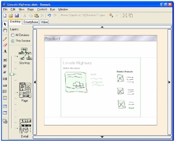
Author/Copyright holder: Damask (Lin and Landay). Copyright terms and licence: All Rights Reserved. Reproduced with permission. See section "Exceptions" in thecopyright terms below.
Figure 37.6: The Damask Authoring Environment (Lin and Landay, 2008)
37.4 Adaptation Rules
How user interfaces adapt to the context of use can be described through rules that can be classified according to the types of effect that they can achieve.
Some adaptations consist of replacement rules: they indicate how to replace some elements according to the current platform. The elements to replace can be single user interface elements as shown in Figure 7. At the bottom we can see an application for accessing train timetables that on the desktop version supports the hour selection through a long drop-down menu while in the mobile version uses a radio button with a limited number of options since the possible hours are grouped.
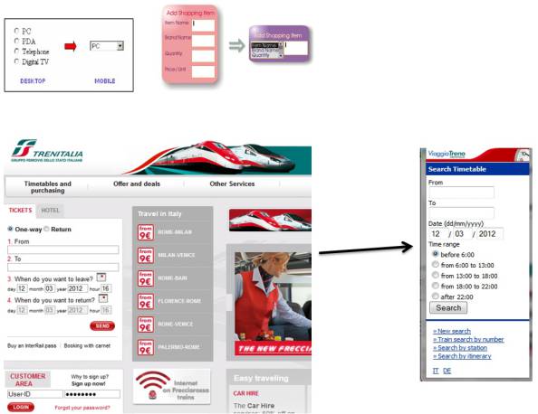
Author/Copyright holder: Courtesy of TrenItalia, ViaggiaTreno (AllRightsRerserved, FairUse). Copyright terms and licence: compositeWorkWithMultipleCopyrightTerms (Work that is derived from or composed of multiple works with varying copyright terms and/or copyright holders).
Figure 37.7: Examples of replacement rules for single elements
Figure 8 shows how a replacement rule can be applied to a group of elements instead of single elements. In this case the grouping refers to query results concerning hotels for a given location. The desktop version (left) shows the results group in such a way as to provide additional information (such as comments from previous visitors), while the mobile version (right) shows details only on request, through elements that can be easily selected by touch.
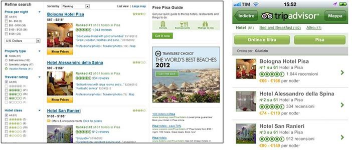
Author/Copyright holder: TripAdvisor. Copyright terms and licence: All Rights Reserved. Used without permission under the Fair Use Doctrine (as permission could not be obtained). See the "Exceptions" section (and subsection "allRightsReserved-UsedWithoutPermission") on the page copyright notice.
Figure 37.8: Examples of replacement rule for a group of elements.
Another type of rule is splitting the user interface into two or more separate presentations. The new interfaces can be obtained in two ways: either by performing the creation of separate user interfaces or by dynamically showing and hiding the elements in order to achieve a similar effect. Figure 9 shows an example of page splitting. It refers to the well-known PacMan game: on the left is the single page presentation, on the right the version for small screens in which there are two presentations: one for playing the game and one for defining various settings.
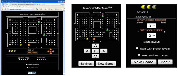
Author/Copyright holder: Various implementations of PacMan (copyright of Namco Limited). Copyright terms and licence: All Rights Reserved. Used without permission under the Fair Use Doctrine (as permission could not be obtained). See the "Exceptions" section (and subsection "allRightsReserved-UsedWithoutPermission") on the page copyright notice.
Figure 37.9: Example of page splitting
In other cases adaptation needs removal rules. The purpose is removing content considered irrelevant for the target device. There can be various reasons for this: technological limitations or manufacturer choices (e.g. iPhones do not support Flash videos); objects removed because too expensive in terms of resources consumed in the new device; elements supporting tasks considered irrelevant for the target device. It is important to remember that removing elements can have an impact on script execution because they can refer to them, and if they are removed then the scripts may not work properly.
The most used adaptation rules are those aimed at changing some user interface properties. In this case the UI elements are the same but their presentations change in terms of: their attributes (e.g. colour, size, etc.): their position in the UI; space between them; overall user interface structure.
The adaptation rules can be expressed in the format: Event / Condition / Action. The event occurrence triggers the evaluation of the rule. Elementary events occur in the interactive application or in the context of use, or a composition of such events. The condition (optional) is a Boolean condition to be satisfied in order to execute the associated action(s); it can be related to something which happened before, or some state condition. The action indicates how the abstract/concrete/implementation description of the interactive application should change in order to perform the requested adaptation. It can change the user interface at different granularities: complete change of UI, change of some UI parts, change of UI elements, or change of attributes of specific UI elements. Here are some examples of adaptation rules:
Event (the user has selected the link to a printer description); condition (the user has selected more than three links to printer descriptions); action (show the five most sold printers)
Event (change of battery level); condition (if the battery level is below a given threshold); action (change screen brightness)
Event (user accesses application); condition (the user is elderly); action (increase font sizes 10%)
Event ((user is outdoors) and (it is lunch time)); condition (there are restaurants nearby); action (show list of nearby restaurants)
Event (application accessed); condition (the device is a mobile phone); action (show master and detail in different presentations)
If we want to consider applications in which accessibility is an important aspect we can have different examples of adaptation rules (Minon et al. 2013):
Event: the noise of the environment changes to a value over 25 decibels; Condition: the user has a mild hearing impairment; Action: all videos must display subtitles.
Event: the user accesses an application with many interaction elements; Condition: the user is blind; Action: an application table of content is created for easy access to each interaction element.
Event: the user interface is activated; Condition: the user is colour-blind; Action: change the foreground colour to black and the background colour to white in order to provide a high-contrast UI.
Event: the UI contains an element with a timeout; Condition: the user has a cognitive disability; Action: remove the timeout or increase the time limit considerably if necessary.
Event: the user interface is activated; Condition: the user has poor vision; Action: activate a screen magnifier.
Event: the user begins to move; Condition: the user has paraplegia and the UI is not rendered with the vocal modality; Action: the user interface is changed to the vocal modality
Event: the application contains many different interaction elements for performing different tasks at the same time; Condition: the user has problems in maintaining attention; Action: the UI is organized in such a way that only one task is supported at a time
Another important aspect to consider is that applications running on mobile devices have often to adapt to contextual events. Thus, there is an increasing interest in proposing environments that allow even people who are not programmers to define their context-dependent applications. Tasker (footnote 1) is an Android app that allows users to perform context-sensitive actions based on simple event-trigger rules. The user can create the context-sensitive rules in terms of tasks (sets of actions, which can be alerts or applications to activate, audio or display properties to change, ... ) executed according to contexts (that depend on aspects such as application, time, date, location, event, gesture, state) in user-defined profiles. Although Tasker is still limited in terms of types of application that can be developed, it is a start nonetheless and moreover demonstrates the utility of this type of contribution. Locale (footnote 2) is another Android app that allows users to create situations specifying conditions under which the user’s phone settings should change. An example of a rule that can be implemented with such tools is: after 4 pm if the battery level is less than 20% and WiFi is active then disable WiFi and decrease the screen luminosity.
37.5 Model-based UI Design in Multi-Device Contexts
Models are abstractions of real entities. We use models in our life more often than is generally acknowledged. For example, often in the morning we think about the main activities to carry out during the day, thus creating a model of the day.
In model-based approaches the basic idea is to use languages that describe the main aspects in conceptual terms in order to allow designers and developers to concentrate on the main semantic aspects and avoid having to learn a plethora of implementation languages. In this way it is also possible to link semantic information and implementation elements. We are referring here to the interaction semantics, which define the purpose of the user interface elements. This makes it possible to obtain device interoperability through many possible implementation languages because through implementation generators it is possible to derive various adapted implementations from logical descriptions. One further advantage of more semantic descriptions is that they facilitate support from assistive technology since the purpose of each element is more clearly defined.
The community working on model-based approaches has agreed in identifying a number of abstraction levels that can be considered when describing interactive applications, they are:
Tasks and domain objects: At this level the purpose is to describe the activities that should be performed in order to reach the users’ goals and the objects that need to be manipulated for this purpose. An example of concept at this level is “I want to select a work of art”. Notations that have been used to represent this type of description are ConcurTaskTrees (Paterno, 2000) or GOMS (John and Kieras, 1996).
Abstract Interactive Application: At this level the focus moves to the interactive part of an application and aims to provide its description in terms independent of the interaction modality used. An example of concept at this level is “Single selection object with high cardinality”. There is a need for an interaction object able to achieve this effect without specifying any detail that is modality-dependent; thus it is not indicated whether the object should be selected through a graphical interaction or a vocal command or a gesture.
Concrete Interactive Application: The description is modality dependent but independent of the implementation language. A concept example is “List Interaction object with X elements”. The assumption is that a graphical modality is used and a list element is required. However, such a list element can be obtained in various implementation languages.
Interactive Application Implementation: Here we have the actual implementation in some implementation language. Thus, for example the List object can be implemented in a toolkit for Java user interfaces (e.g. AWT) or HTML or other user interface libraries.
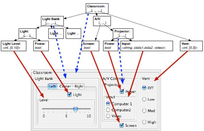
Figure 10 shows a small example of a multi-device user interface obtained through a model-based approach. In the top left part there is an abstract description consisting of a group of two elements, one for making a choice and one for providing a value in a range. Then, we can see three possible implementations for a mobile device, a desktop, and a domestic appliance. The choice is implemented through a radio button in the mobile device, two buttons in the desktop, and a switch in the physical appliance; while the value in range is obtained through a slider in the mobile device, a spin-box in the desktop device, and a lever in the appliance.
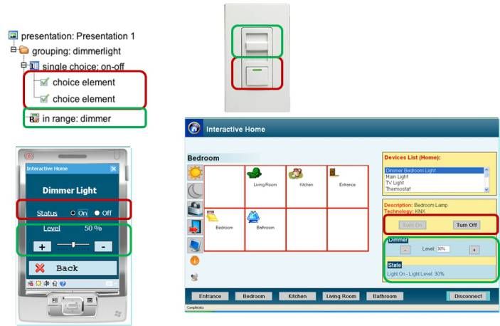
Author/Copyright holder: Fabio Paterno. Copyright terms and licence: All Rights Reserved. Reproduced with permission. See section "Exceptions" in the copyright terms below.
Figure 37.10: Example of model-based description of multi-device user interface
Currently there is a working group on model-based UI in W3C that is developing standards based on these concepts (see at http://www.w3.org/2011/mbui/). In addition, such concepts have proven to be useful for accessibility. Indeed, recently another group in W3C, the Independent User Interface (IndieUI) group, has been set up (http://www.w3.org/WAI/intro/indieui). It aims to make it easier for web applications to work in a wide range of contexts — different devices, different assistive technologies (AT), different user needs. Figure 11 shows an example of how an application can manage an event (Scroll Down) in a way independent of how it has been actually triggered from different technologies.
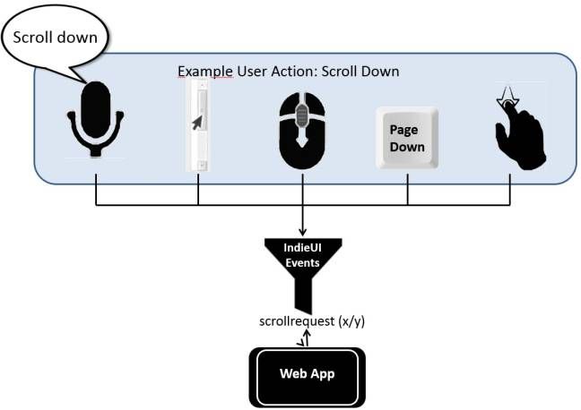
Author/Copyright holder: Fabio Paterno. Copyright terms and licence: All Rights Reserved. Reproduced with permission. See section "Exceptions" in the copyright terms below.
Figure 37.11: Example of abstract event
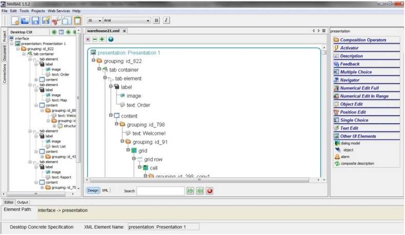
One issue with model-based approaches is that the development of the models sometimes has requirements that designers cannot address. To partially solve this problem reverse engineering approaches and tools have been developed. The basic idea is that such tools are able to analyse the user interface implementation and build the corresponding underlying model. An example is described in Bellucci et al. (2012) in which the tool presented is able to analyse Web pages, including the associated stylesheets, and build the corresponding logical description in such a way as to preserve the original scripts. One of the most engineered model-based languages is MARIA (Paterno et al., 2009), which includes: support for Data Model useful for specifying the format of input values, association of various data objects to the various interactors; an Event Model, which associates each interactor with a set of events that can be either property change events or activation events (e.g. access to a web service or a database); a Dialogue Model, which specifies the dynamic behaviour (what events can be triggered at a given time). The dialogue expressions are connected using CTT operators in order to define their temporal relationships; the ability to support user interfaces including complex and Ajax scripts able to continually update fields by invoking external functions, which can be implemented as Web services, without explicit user request; and dynamic set of user interface elements, which can be obtained through conditional connections between presentations or the possibility of changing only a UI part. It is notable that HTML 5 is evolving in the same direction by introducing a number of more semantic tags (such as navbar, article, etc.) which provide more explicit hints of the purpose of the associated elements. However, HTML 5 is mainly limited to graphical, form-based user interfaces. Thus, it is not able to address the increasing availability of various interaction modalities.
MARIA is also supported by an authoring environment, MARIAE (the MARIA Environment, publicly available at http://giove.isti.cnr.it/tools/MARIAE/home), which provides a graphical direct manipulation support to edit interactive applications at various abstraction levels and generate the corresponding implementation for various platforms, also using different interaction modalities. Figure 12 shows how the tool supports editing a logical description; on the left is the interactive tree representing the structure of the application, in the central area we have the graphical representation of the selected presentation with the possibility to drag-and-drop the relevant elements dynamically shown on the right.
Author/Copyright holder: HIIS Laboratory. Copyright terms and licence: All Rights Reserved. Used without permission under the Fair Use Doctrine (as permission could not be obtained). See the "Exceptions" section (and subsection "allRightsReserved-UsedWithoutPermission") on the page copyright notice.
Figure 37.12: The MARIAE Authoring Environment
37.6 Techniques for the Adaptation Phases
In automatic adaptation we can identify three main phases: device identification, interaction resources identification, adaptation.
Device identification can be performed either server-side or client-side. In the server-side case, usually the user agent detection in the HTTP Protocol is carried out. It normally indicates: ([system and browser information]) [platform] ([platform details]) [extensions], for example: Mozilla/5.0 (iPad; U; CPU OS 3_2_1 like Mac OS X; en-us) AppleWebKit/531.21.10 (KHTML, like Gecko) Mobile/7B405. In the client-side case, some level of identification of the main features of the current device can be performed through the markup (for example, the srcset attribute is able to indicate which version of an image to use depending on the main features of the device); or by using the stylesheets, which are associated to different devices by using the media queries; or by using certain scripts (e.g. jQueryMobile provides support for this purpose).
Interaction resources identification is applied when it is necessary to have more detailed information on the currently available interaction resources. The environment should then access them by using a Device Description Repository (DDRs). One format for DDRs is given by the UAProf (User Agent Profile), which describes the capabilities of a mobile handset, including screen size and multimedia capabilities. Mobile handsets send a header (usually "x-wap-profile“) within a http request with the URL to its UAProf. Its production for a device is voluntary. It is based on the Composite Capability/Preference Profiles Specification (CC/PP) created by the World Wide Web Consortium. Another format for DDRs is given by WURFL, which is an XML configuration file that can be stored locally and contains information about capabilities and features for a variety of mobile devices. This information is derived from different sources: UAProf, when available; public documentation; developer reports; actual testing. It has a hierarchical, extensible, structure. It started as an open source project http://wurfl.sourceforge.net/, and now ScientiaMobile, founded by the WURFL team, offers commercial support for these APIs, also as a cloud service. Other commercial tools in this area are Device Atlas (http://deviceatlas.com), and DetectRight (http://www.detectright.com).
In general, the device properties can be classified as either static, which cannot change during application execution, such as operating system, RAM size, available storage, display size, input devices, markup support, CSS support, image format support, script support, etc.; or as dynamic, such as device tilting, network technology in use, quality of connection, battery level, location, orientation, acceleration, light, noise, etc. Media queries are able to detect a limited set of media features: width, height, device-width, device-height, orientation, aspect-ratio, device-aspect-ratio, color, color-index, monochrome, resolution.
The third phase is adaptation. There can be various approaches to automatic re-authoring:
Scaling: just linearly scaling according to the interaction resources of the available device, such as Safari on iPhone does when loading a Web page developed for desktop systems;
Transducing: preserves initial structure and translates elements into other formats, and compresses and converts images to match device characteristics;
Transforming: goes further to modify both contents and structures originally designed for desktop systems to make them more suitable for display on small screens.
The problem of performing an automatic adaptation from a desktop to a mobile version able to change the user interface structure can be addressed by first calculating the costs in terms of screen space required by the various elements: i.e. the vertical and horizontal space required by a text, image dimensions, interline value, interactor type, etc. Next, calculating the space required by the user interface in the target device should also consider how much tolerance in scrolling should be allowed, how much additional space should be available for tables, and similar aspects. If the result is higher than the sustainable cost for the target device then the adaptation of the user interface elements should be considered (e.g. using smaller images and replacing interactive elements with equivalent ones that take less space). If the resulting overall cost is still excessive for the target device screen then splitting the user interface into multiple presentations should be considered. In order to decide how splitting into multiple presentations should be performed the user interface can be considered as a set of groups of elements, which cannot be split internally. Thus, the decision is how to distribute such groups in order to obtain presentations sustainable by the target device. Splitting can be implemented either creating separate mobile presentations or by showing the relevant elements dynamically. This adaptation process can be customized according to certain parameters and rules, such as how much scrolling should be allowed in the target device or what policy to follow in distributing the groups of elements in the target device. In this adaptation process sometimes tables are critical elements because when they are shown on the small screen device they are too large. Some techniques have been proposed to handle such issues, for example Tajima and Ohnishi (2008) introduce dynamically scripts that allow some columns and/or rows to be collapsed interactively in order to enable users to relate better the elements of interest in the table.
Another interesting adaptation technique is page summarization, whose purpose is the automatic reduction of content in order to make it more suitable for small screens. There are two types of approach to this issue. The Abstraction-based approach uses sentence manipulation techniques like reduction, compression and reformulation. The Extraction-based approach assigns scores to sentences in order to select those which better represent the whole text; it can be feature-based (e.g. term frequency, sentence position, attributes, etc.), or make use of machine learning or graph based techniques.
An example of summarization is that supported by PowerBrowser (Buyukkokten et al., 2002). The basic idea was that the importance of a keyword depends on the frequency with which it occurs in a text and in a larger collection. A word within a given text is considered most important if it occurs frequently within the text, but infrequently in the larger collection. The significance factor of a sentence is derived from an analysis of its constituent words. The sentences in which the greatest number of frequently occurring distinct words are found in closest proximity are probably important. People interested in such techniques can use MEAD, a public multi-document summarization system, which provides more flexible support in this area (see http://www.summarization.com/mead/).
Crowd-sourcing techniques are based on the idea of allocating some tasks to perform through an open call. These techniques are acquiring increasing importance and can be applied to adaptation as well. For example, Nebeling and Norrie have applied them to adaptation of Web pages. The goal is to support developers in specifying Web interfaces that can adapt to the range and increased diversity of devices. For this purpose they have introduced a tool that augments Web pages to allow users to customize the layout of Web pages for specific devices. Devices are classified in terms of window size, screen resolution, and orientation. It is then possible to share adaptations so that others with the same device and with similar preferences can directly benefit. The same group ( Nebeling et al, 2013) has developed a tool, W3Touch, whose purpose is to support adaptation for touch according to metrics. The tool produces analytics of the user interaction in order to help designers detect and locate potential design problems for mobile touch devices. For this purpose two metrics are considered: Missed links ratio, which keeps track of how often touches miss an intended target; and Zoom level, which considers how much users on average need to zoom into different components of the Web interface.
Another important aspect to consider is how to evaluate adaptation. For this purpose in Manca et al. (2013) a set of relevant criteria are indicated:
User’s awareness of adaptation: to what extent the user is able to realise that a change in the UI is caused by adaptation;
Appropriateness of adaptation: whether the system selects a good/appropriate adaptation strategy;
Transition of adaptation: to what extent the adaptation process allows users to realise what is happening during adaptation;
Continuity of adaptation: to what extent it is easy to continue the interaction after adaptation;
Impact of adaptation in decreasing interaction complexity: whether the interaction complexity of the system decreases;
Impact of adaptation in increasing user satisfaction: to what extent adaptation increases the user’s satisfaction.
37.7 Vocal Interfaces
Vocal interfaces can play an important role in various contexts: with vision-impaired users; when users are on the move; more generally when the visual channel is busy. Examples of possible applications are booking services, airline information, weather information, telephone list, news. However, vocal interactive applications have specific features that make them different from graphical user interfaces. They are linear and non-persistent, while graphical interfaces support concurrent interactions and are persistent. The advantage of vocal interfaces is that they can be fast and natural for some operations.
Recently there has been increasing interest in vocal interfaces since vocal technology is improving. It is becoming more robust and immediate, without need for long training, and thus various its applications have been proposed in the mass market, e.g. vocal searches and map navigation by Google or Siri on iPhone. This has been made possible by providing the possibility of entering vocal input with audio stored locally and then sent to the server for speech recognition. Vocal menu-based navigation must be carefully designed: there is a need for continuous feedback in order to check the application state, it should provide short prompts and option lists to reduce memory efforts, and should support management of specific events (no-input, no-match, help). Although the logical structure of a graphical page is a tree, its depth and width are too large for vocal browsing. Figure 13 shows an example of a graphical user interface and represents its logical structure by using polygons with solid borders to indicate the main areas, and then dashed borders to indicate sub-areas inside them.
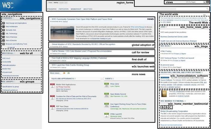
Author/Copyright holder: W3C. Copyright terms and licence: All Rights Reserved. Used without permission under the Fair Use Doctrine (as permission could not be obtained). See the "Exceptions" section (and subsection "allRightsReserved-UsedWithoutPermission") on the page copyright notice.
Figure 37.13: Logical structure of a graphical user interface
Figure 14 shows on the left a corresponding vocal menu automatically derived according to an algorithm (Paterno and Sisti,2011) in which the texts of the vocal menu items are derived either from elements id or from the section contents. On the right of Figure 14 there is an example of vocal dialogue that can be obtained from such a vocal interface.
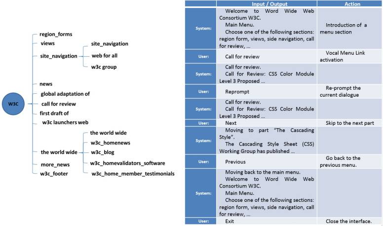
Author/Copyright holder: Paterno and Sisti. Copyright terms and licence: All Rights Reserved. Reproduced with permission. See section "Exceptions" in the copyright terms below.
Figure 37.14: Vocal version of the example user interface
37.8 Multimodal User Interfaces
Multimodality concerns the identification of the most effective combination of various interaction modalities. A simple vocabulary for this purpose was provided by the CARE properties (Coutaz et al., 1995): complementarity, the considered part of the interface is partly supported by one modality and partly by another one; assignment, the considered part of the interface is supported by one assigned modality; redundancy, the considered part of the interface is supported by both modalities; equivalence, the considered part of the interface is supported by either one modality or another. In Manca et al. (2013) the authors describe how to exploit them more in detail for the design and development of multimodal user interfaces: they can be applied to composition operators, interaction and output-only elements. In the case of interaction elements, it is possible to decompose them further into three parts: prompt, input, and feedback, which can be associated with different CARE properties. In this approach equivalence can be applied only to the input elements since only with them the user can choose which element to enter, while redundancy can be applied to prompt and feedback but not to input since once an input is entered through a modality it does not make sense to enter it also through another modality.
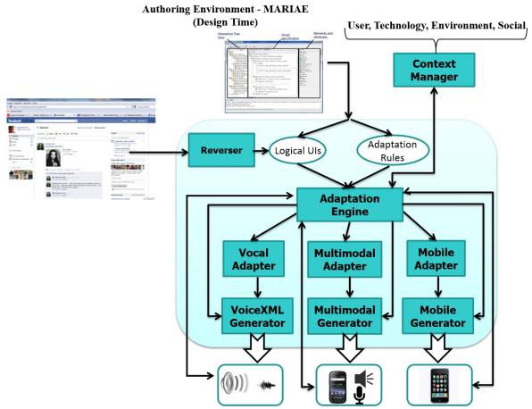
Figure 15 shows a general architecture for supporting adaptive multimodal user interfaces. There is a context manager able to detect events related to the user, technology, environment and social aspects. Then, the adaptation engine receives the descriptions of the user interface and the possible adaptation rules. The descriptions of the user interfaces can be obtained through authoring environments at design time or generated automatically through reverse engineering tools at run-time. When events associated with any adaptation rule occur, then the corresponding action part should be executed. For this purpose three options are possible:
complete change of interaction modality: the corresponding adapter should be invoked in order to make the corresponding complete adaptation to the new modality, and then the new user interface is generated;
some change in the current user interface structure should be performed; then its logical description should be modified and the new implementation generated;
small changes in the current user interface should be performed, e.g. changes of some attributes in some elements; then the changes can be performed directly in the implementation through adaptation scripts.
Author/Copyright holder: HIIS Laboratory. Copyright terms and licence: All Rights Reserved. Used without permission under the Fair Use Doctrine (as permission could not be obtained). See the "Exceptions" section (and subsection "allRightsReserved-UsedWithoutPermission") on the page copyright notice.
Figure 37.15: A general architecture for multimodal adaptation
It is now possible to obtain multimodal applications also in the Web. A first possibility was provided by X+V, a language integrating HTML and VoiceXML. However, such language is no longer supported by current browsers.
In Manca et al. (2013) a novel solution is proposed, obtained by extending HTML and CSS for accessing Google support for the vocal part (through CSS annotations interpreted by specific Javascripts). Desktop applications can exploit Chrome extensions through Javascripts to access ASR and TTS Google APIs according to such CSS annotations. This implementation is still not possible for Chrome mobile version. Thus, mobile applications need to create instances of Web View components able to load Web pages and access ASR and TTS APIs through Java. In first empirical tests associated with this solution for context-dependent multimodal adaptation the results are encouraging. User feedback pointed out that users like to have control on modality distribution for supporting personal preferences. It also turned out that the choice of the modalities should take into account the tasks to support, beyond the current context of use, for example showing long query results is something inherently preferable to present graphically since the vocal modality is not persistent and when the last results are presented vocally the user may have forgotten the initial ones. Another aspect is that mixing modalities at the granularity of parts of single UI elements is not always considered appropriate; for example, in considering a single text field which has to be selected graphically, it is not perceived meaningful then to ask to enter the value vocally.
37.9 Distributed User Interfaces
When considering user access in multi-device environments we can identify various possibilities:
Accessing applications through different devices at different times (one device at each time);
Distributed user interfaces: application logic receiving input from multiple devices;
Moving objects across interactive devices (e.g. through pick-and-drop (Rekimoto, 87));
Migratory user interfaces: device change, interface migration with state preservation.
Distributed UIs and migratory UIs are two independent concepts, indeed there may exist distributed UIs which are also able to migrate, but there are also only distributed user interfaces (which do not migrate at all), or migratory UIs that are not distributed across multiple devices.
Multi-device support is emerging in various environments. OS X Lion Resume (footnote 3) provides a
'Resume' feature, which lets users pick up where they left off their applications, along with their user interfaces. Chrome-to-phone (footnote 4) enables users to send links from their Chrome desktop browser to App on their Android device. Chrome-to-mobile (footnote 5) sends pages from your computer’s Chrome browser to the Chrome browser running on your mobile device. Firefox (footnote 6)
synchronizes bookmarks, tabs, and web history between desktop and mobile Firefox clients.
At research level, Myngle (Sohn et al., 2011) provides a unified Web history from multiple personal devices, and allows users to filter their history based on high-level categories.
When considering specifically distributed user interfaces, it is important to note that there are three types of information important to specify (Frosini et al., 2013): what interface parts have to be distributed; whether to enable input on such parts; target device(s), which should receive the distributed parts (they can be identified by device types, IDs, roles associated with devices).
Generally speaking the distribution can be defined in different ways:
In the description of the interactive application with the initial application specification (design-time);
Distribution defined through the handlers of the distribution events indicated in the interactive application specification (design-time definition + run-time execution);
Distribution obtained through dynamic customization tools (completely run-time), which allow users to obtain distributions that were not planned at design time.
An example of distribution obtained through dynamic customization tools is presented in Manca and Paterno (2013). It uses the CARE properties to specify distribution in a MARIA-based description. When the application is generated it is still possible for the end user to customise its distribution across various devices through an interactive tool in order to address needs not foreseen at design time. Figure 16 shows an example: at the beginning the user interface is completely assigned to a mobile device; then through the interactive customization tool some elements are assigned to the large screen and others are redundant across the two devices.
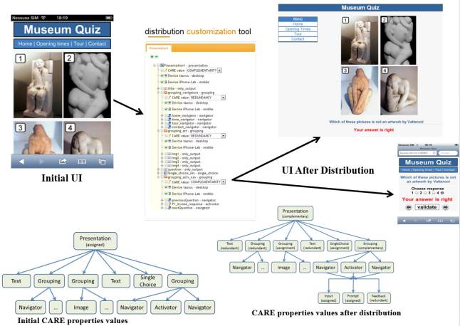
Author/Copyright holder: Manca and Paterno. Copyright terms and licence: All Rights Reserved. Reproduced with permission. See section "Exceptions" in the copyright terms below.
Figure 37.16: Example of dynamic user interface distribution
37.10 Migratory Interactive Applications
One of the main sources of frustration in current ubiquitous environments is that users need to restart their applications for each device change. In order to exploit the current technological offer there is a need for continuous access to interactive services across various devices. Migratory user interfaces can transfer among different devices (from ‘source’ devices to ‘target’ devices), so as to allow the users to continue their tasks. Various approaches to their implementation have been investigated (pixel replication, interactive applications, virtual machines, etc.). Several application domains can benefit from them such as shopping, online auctions, games, making reservations. They are characterised by the ability to preserve the state of the interactive part (which can include user input, focus elements, cookies, sessions, history bookmarks, etc).
An example of a solution supporting migratory user interfaces is DeepShot (Chang and Li, 2011). It identifies the application that the user is looking through the camera, recovers its state, and migrates it onto the mobile phone, with the information on the state encoded as URI. A video is available at
Various solutions for migration of interactive applications have been investigated within the EU OPEN project (http://saturno.isti.cnr.it:88/), which have been applied in various applications (games, emergency, social networks). Their detailed description is given in a book on Migratory Interactive Applications in Ubiquitous Environments
(http://www.springer.com/computer/information+systems+and+applications/book/978-0-85729-249-0). One such solutions has focused on an environment supporting migration of Web pages. This is obtained through a proxy server able to inject scripts that introduce the possibility to send the DOM of the page and its current state when migration is triggered through a migration client, which is a separate Web application able to communicate with the migration server and the applications.
There are some specific aspects that characterise usability in such environments. They are related to continuity, such as time required by the migration process from the trigger on source device to the user interface presentation on target device. The transition should be understandable by users, in the sense that users should be able to understand that a migration is taking place. The adaptation result should not make it difficult for the user to understand how to proceed. Another important aspect is predictability: users should be able to predict the target device, what UI parts are going to migrate, and where the user’s interactions results will appear after migration.
In order to make the migration environments more flexible we can introduce the possibility of partial migration in which the users interactively select the parts that they want to migrate to the target devices. This can be useful, for example, in desktop-to-mobile migration if users want to limit the parts to migrate in order to avoid overloading the limited screen of the target device. One issue with migration of Web applications is the state of JavaScripts. Indeed, if the state associated with JavaScript variables is not properly saved and restored, inconsistencies can be experienced: some variables no longer exist in the new version uploaded or some variables might hold incorrect values.
In any case, migratory interfaces can provide useful support also in multi-user environments. In Ghiani et al. (2012) an interesting scenario is discussed in which colleagues planning a business trip exploit it in order to push or pull web pages which contain useful information and data for their trip. A video illustrating this scenario is available at http://www.youtube.com/watch?feature=player_embedded&v=0cOlm28n_YE. This type of environment can raise a number of privacy issues that need to be addressed by providing users with control on whether each device is visible to others, whether the pages navigated on a device can be detectable by others, and whether a device can be a target of a migration. Such possibilities can be assigned only to specific users or groups of users.
Further issues can be generated in terms of security, including theft of private information from the migrated UIs, such as data entered by users (credit card, password, etc.) or data included in the page (bank profile, etc.) or information stored in forms, sessions, cookies. Other risks can be due to impersonating the user through authentication attack. Some of such issues can be addressed by automatically analysing the elements in the interactive forms in order to identify whether they can contain confidential data and, in this case, to handle their content in the migration process by using secure protocols, even if they were not used in the original application.
37.11 Conclusions
To summarise, we can say that a variety of solutions have been developed to better exploit multi-device environments. It can be useful to have a set of logical dimensions that allow designers and developers to compare them. A set of such dimensions along with some values that can be useful to differentiate them is provided by Paterno and Santoro (2012) and are:
Distribution: whether it is static or dynamic;
Migration: according to the state components that it is able to preserve: form state, function state, sessions, history, bookmarks, etc.;
Granularity: whether the solution can involve entire UI, groups, single UI elements, parts of UI elements;
Trigger Activation type: which can be on demand or automatic or mixed;
Interaction modalities: whether the solution is monomodal, transmodal or multimodal;
Type of UIs activated: whether they are precomputed or generated at runtime or a mixed solution;
Device sharing between multiple users: whether the sharing consists of the possibility of moving elements in the same device or whether the user can interact with the same device;
Timing: whether the user interface changes are immediate, deferred or mixed;
Adaptation Approach: whether it is a scaling, transducing or transforming approach;
Architecture: whether the architectural solution is server-based or peer-to-peer.
Of course, we are still far from having solved all the interesting issues that characterise multi-device environments. There are various aspects that deserve further investigation, such as integrated support for adaptation to a variety of Post-WIMP interaction techniques or more general solutions for preserving the functionality state in migration. Both migration from multiple devices to multiple devices and crowd-sourced adaptation have received limited attention so far. EUD environments for context-dependent applications need more effective metaphors and solutions and there is still a lack of general solutions to exploit peer-to-peer communication in distributed and migratory user interfaces.
37.12 References
Arthur, Richard and Jr., Dan R. Olsen, (2011): XICE windowing toolkit: Seamless display annexation. In ACM Transactions on Computer-Human Interaction, 18 (3) p. 14
Bellucci, Federico, Ghiani, Giuseppe, Paterno, Fabio and Porta, Claudio (2012): Automatic reverse engineering of interactive dynamic web applications to support adaptation across platforms. In: Proceedings of the 2012 International Conference on Intelligent User Interfaces 2012. pp. 217-226
Buyukkokten, Orkut, Kaljuvee, Oliver, Garcia-Molina, Hector, Paepcke, Andreas and Winograd, Terry (2002):Efficient web browsing on handheld devices using page and form summarization. In ACM Transactions on Information Systems, 20 (1) pp. 82-115
Chang, Tsung-Hsiang and Li, Yang (2011): Deep shot: a framework for migrating tasks across devices using mobile phone cameras. In: Proceedings of ACM CHI 2011 Conference on Human Factors in Computing Systems 2011. pp. 2163-2172
Frosini, Luca, Manca, Marco and Paterno, Fabio (2013): A Framework for the Development of Distributed Interactive Applications. In: EICS 13 Proceedings of the 5th ACM SIGCHI symposium on Engineering interactive computing systems June 24-27, 2013, London, United Kingdom. pp. 249-254
Gajos, Krzysztof Z., Weld, Daniel S. and Wobbrock, Jacob O. (2010): Automatically generating personalized user interfaces with Supple. In Artificial Intelligence, 174 (12) pp. 910-950
Gajos, Krzysztof Z., Hurst, Amy and Findlater, Leah (2012): Personalized dynamic accessibility. In Interactions, 19 (2) pp. 69-73
Ghiani, Giuseppe, Paterno, Fabio and Santoro, Carmen (2013): Interactive customization of ubiquitous Web applications. In Journal of Visual Languages & Computing, 24 (1) pp. 37-52
Ghiani, Giuseppe, Paterno, Fabio and Santoro, Carmen (2012): Push and pull of web user interfaces in multi-device environments. In: Proceedings of the 2012 International Conference on Advanced Visual Interfaces 2012. pp. 10-17
Ghiani, Giuseppe, Paterno, Fabio and Isoni, Lorenzo (2012): Security in migratory interactive web applications. In:Proceedings of the 11th International Conference on Mobile and Ubiquitous Multimedia MUM December 4-6, 2012, Ulm, Germany.
John, Bonnie E. and Kieras, David E. (1996): The GOMS Family of User Interface Analysis Techniques: Comparison and Contrast. In ACM Transactions on Computer-Human Interaction, 3 (4) pp. 320-351
Lin, James and Landay, James A. (2008): Employing patterns and layers for early-stage design and prototyping of cross-device user interfaces. In: Proceedings of ACM CHI 2008 Conference on Human Factors in Computing Systems April 5-10, 2008. pp. 1313-1322
Manca, Marco and Paterno, Fabio (2011): Flexible support for distributing user interfaces across multiple devices. In:Proceedings of CHI 2011 Conference on Human Factors in Computing May 7-12, 2011, Vancouver, Canada. pp. 191-195
Manca, Marco, Paterno, Fabio, Santoro, Carmen and Spano, Lucio D. (2013): Generation of Multi-Device Adaptive MultiModal Web Applications. In: Proceedings of 10th International Conference on Mobile Web Information Systems MobiWIS 2013 August 26-29, 2013, Paphos, Cyprus. pp. 218-232
Miñón, Raúl, Paternò, Fabio and Arrue, Myriam (2013): An environment for designing and sharing adaptation rules for accessible applications. In: Proceedings of the 5th ACM SIGCHI Symposium on Engineering Interactive Computing Systems EICS 2013 June 24-27, 2013, London, United Kingdom. pp. 43-48
Nebeling, Michael, Speicher, Maximilian and Norrie, Moira C. (2013): CrowdAdapt: Enabling Crowdsourced Web Page Adaptation for Individual Viewing Conditions and Preferences. In: Proceedings of the 5th ACM SIGCHI Symposium on Engineering Interactive Computing Systems EICS 2013 June 24-27, 2013, London, United Kingdom.
Nebeling, Michael, Speicher, Maximilian and Norrie, Moira C. (2013): W3touch: metrics-based web page adaptation for touch. In: Proceedings of CHI 2013 Conference on Human Factors in Computing April 27-May 2, 2013, Paris, France. pp. 2311-2320
Nigay, Laurence, Coutaz, Joëlle, Salber, Daniel, Blandford, Ann, May, Jon and Young, Richard M. (1995): Four Easy Pieces for Assessing the Usability of Multimodal Interaction: the CARE Properties. In: Nordby, Knut (ed.)Proceedings of INTERACT 95 - IFIP TC13 Fifth International Conference on Human-Computer Interaction June 25-29, 1995, Lillehammer, Norway. pp. 115-120
Paterno, Fabio (1999): Model-Based Design and Evaluation of Interactive Application. London, United Kingdom,
Paterno, Fabio and Santoro, Carmen (2012): A logical framework for multi-device user interfaces. In: ACM SIGCHI 2012 Symposium on Engineering Interactive Computing Systems 2012. pp. 45-50
Paterno, Fabio, Santoro, Carmen and Spano, Lucio Davide (2009): MARIA: A universal, declarative, multiple abstraction-level language for service-oriented applications in ubiquitous environments. In ACM Transactions on Computer-Human Interaction, 16 (4) p. 19
Paterno, Fabio (2013): End User Development: Survey of an Emerging Field for Empowering People. In ISRN Software Engineering, p. 11
Paterno, Fabio and Sisti, Christian (2011): Model-based customizable adaptation of web applications for vocal browsing. In: Proceedings of the 29th ACM international conference on Design of communication SIGDOC 11October 3-5, 2011, Pisa,Italy. pp. 83-90
Rekimoto, Jun (1997): Pick-and-Drop: A Direct Manipulation Technique for Multiple Computer Environments. In:Robertson, George G. and Schmandt, Chris (eds.) Proceedings of the 10th annual ACM symposium on User interface software and technology October 14 - 17, 1997, Banff, Alberta, Canada. pp. 31-39
Sohn, Timothy, Li, Frank Chun Yat, Battestini, Agathe, Setlur, Vidya, Mori, Koichi and Horii, Hiroshi (2011): Myngle: unifying and filtering web content for unplanned access between multiple personal devices. In: Proceedings of the 2011 International Conference on Uniquitous Computing 2011. pp. 257-266
Tajima, Keishi and Ohnishi, Kaori (2008): Browsing large HTML tables on small screens. In: Cousins, Steve B. andBeaudouin-Lafon, Michel (eds.) Proceedings of the 21st Annual ACM Symposium on User Interface Software and Technology October 19-22, 2008, Monterey, CA, USA. pp. 259-268
Wäljas, Minna, Segerståhl, Katarina, Väänänen-Vainio-Mattila, Kaisa and Oinas-Kukkonen, Harri (2010): Cross-platform service user experience: a field study and an initial framework. In: Proceedings of 12th Conference on Human-computer interaction with mobile devices and services 2010. pp. 219-228
